Answer: WPF stands for Windows Presentation Foundation. It's a re-invention of a UI for Desktop applications using WPF. Apart from dropping controls on "Windows Forms" just as developers have been doing for years, WPF provides an extra rapid boost to the application development including Rich User Interface, Animation and much more.
In a nutshell the following things can be done using WPF:
Advantages
See for more detail:
Answer: The content of content controls in WPF is dealt using various properties. These two properties are HorizontalContentAlignment and VerticalContentAlignment. These properties are defined in the System.Windows.Controls.Control class that is the parent class of all controls in WPF.
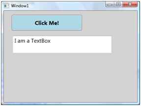
If we create a UI with a Button and a TextBox control, the UI looks like the following figure where the default vertical and horizontal alignment of content of a Button is center. The default vertical and horizontal alignment of content of a TextBox is left and top.

You want to set the contents of the Button and TextBox to bottom and right.
The code sets VerticalContentAlignment and HorizontalContentAlignmentproperties to bottom and right.
<Grid Name="StackPanel1" Background="LightGray">
    <Button Name="Button1" Background="LightBlue" Height="45" Content="Click Me!" Margin="23,12,159,0" VerticalAlignment="Top" FontSize="16" FontWeight="Bold" VerticalContentAlignment="Bottom" HorizontalContentAlignment="Right" />
    <TextBox Height="50" Margin="26,72,74,0" Name="textBox1" VerticalAlignment="Top" Text="I am a TextBox" FontSize="16" VerticalContentAlignment="Bottom" HorizontalContentAlignment="Right" />
</Grid>
Output that looks as in Figure:

See for more details:
Answer: Windows Presentation Foundation (WPF) resources provide a simple way to reuse commonly defined objects and values. Resources in WPF allow you to set the properties of multiple controls at a time. For example, you can set the background property on several elements in a WPF application using a single resource.
The best way of defining the resources is on a Window or Page element level. Any resource that you define for an element also applies to their child elements of that element. For example, if you define a resource for a Window element that has a Grid as a child element, then the resources defined for the window elements can also be used by the grid element. However, if you define a resource for the grid element, then the resource applies only to the child elements of the grid element.
Syntax for resources in WPF,
<elementName propertyName="{markupExtension keyName}">
<!-Content -->
</elementName>
Where,
There are two types of resource, namely,
See for more details:
There are two types of resource, namely,
Let's see basics of both resources,
Static Resource
We should use the StaticResource markup extension to define the resource as a static resource. The value of StaticResource is determined at the time of loading.
Let's have a sample program, Add the below code snippet in Window1.xaml file inside the Grid.
<Grid.Resources>
   <SolidColorBrush x:Key="lblbgcolor" Color="Blue"/>
</Grid.Resources>
<Label Name="lbl" Margin="71,44,77,0" Background="{StaticResourcelblbgcolor}" Height="49" />
Above code, Grid control uses the Resources property (<Grid.Resources>) to define resource. SolidColorBrush resource named lblbgcolor defined. lblbgcolor resource is used to set the background property of lable.
Dynamic Resource
Dynamic Resource we use in a situation where we want to change the value of property at run time.
Let's have a sample program, Add the following code snippet in Window1.xaml file inside the Window element.
<Window.Resources>
   <SolidColorBrush x:Key="brush" Color="Red" />
</Window.Resources>
<Button x:Name="btn" Content="Click Me" Click="Button_Click" Background="{DynamicResource brush}" Height="100" Width="100" />
Open code behind and add the following code snippet.
private void Button_Click(object sender, RoutedEventArgs e)
{
   this.btn.SetResourceReference(BackgroundProperty, "brush");
}
In the above code, Window control uses the Resources property (<Window.Resources>) to define resource. SolidColorBrush resource named brush defined. Brush resource is used to set the background property of button.
See for more details:
Answer: A Value Converter functions as a bridge between a target and a source and it is necessary when a target is bound with one source, for instance you have a text box and a button control. You want to enable or disable the button control when the text of the text box is filled or null.
In this case you need to convert the string data to Boolean. This is possible using a Value Converter. To implement Value Converters, there is the requirement to inherit from I Value Converter in the System.Windows.Data namespace and implement the two methods Convert and Convert Back.
Note: In WPF, Binding helps to flow the data between the two WPF objects. The bound object that emits the data is called the Source and the other (that accepts the data) is called the Target.
Example
using System;
using System.Collections.Generic;
using System.Linq;
using System.Text;
using System.Threading.Tasks;
using System.Windows.Data;
namespace ValueConverters
{
    public class ValueConverter: IValueConverter
    {
        public object Convert(object value, Type targetType, object parameter, System.Globalization.CultureInfo culture)
        {
            bool isenable = true;
            if (string.IsNullOrEmpty(value.ToString()))
            {
                isenable = false;
            }
            return isenable;
        }
        public object ConvertBack(object value, Type targetType, object parameter, System.Globalization.CultureInfo culture)
        {
            throw new NotImplementedException();
        }
    }
}
See for more details:
Answer: MVVM (Model View ViewModel) is a framework for making applications in WPF. MVVM is the same as the MVC framework. It is a 3-tier architecture plus one more layer. We can do loose coupling using MVVM.
MVVM was introduced by John Gossman in 2005 specifically for use with WPF as a concrete application of Martin Fowler's broader Presentation Model pattern. The implementation of an application, based on the MVVM patterns, uses various platform capabilities that are available in some form for WPF, Silverlight Desktop/web, and on Windows. Many commercial applications, including Microsoft Expression products, were built following MVVM.
Advantage of MVVM
List of features of MVVM
See for more details:
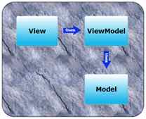
Answer: The View is the client interface, input-output interface or the user interface. It collects all the user interface elements of the window, navigation page, user control, resource file, style and themes, custom tools and controls. The view is unaware of the ViewModel and the Model, and vice versa the ViewModel and Model is unaware of the View and control is tightly decoupled.
But the view model is aware of the needs of the view. They communicate by data binding and a dependency property or properties.
ViewModel in MVVM
ViewModel is a non-visual class. The MVVM Design Pattern does not derive from any WPF or Silverlight based class. The ViewModel is unaware of the view directly. Communication between the View and ViewModel is through some property and binding. Models are connected directly to the ViewModel and invoke a method by the model class, it knows what the model has, like properties, methods etcetera and also is aware of what the view needs.
One View-Model can connect to multiple models, work like a one-to-many relationship and encapsulate business logic and data for the View. A ViewModel inherits some interface like INotifyPropertyChanged, icommand INotifyCollectionChanged etcetera.
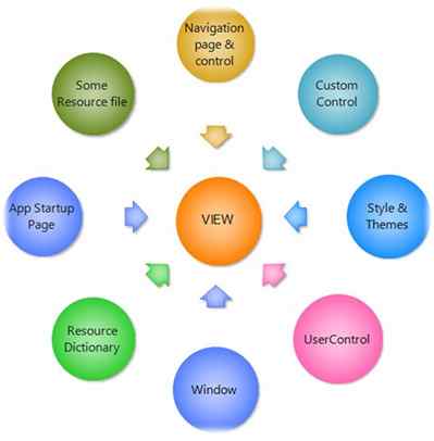
See for more details:
Answer: Command pattern is one of the most powerful design patterns in object oriented design patterns. This pattern allows you to decouple the request of an action from the object that actually performs an action, in other words a command pattern represents an action as an object. A Command object does not contain the functionality that is to be executed. This removes the direct link between the command definitions and the functionality and it’s promoting a loose coupling. When you want to implement operations based on the user request then the command pattern is the best pattern to handle your object.
The following are the members of the Command Design Pattern:
Flow of Command Design Pattern
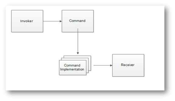
ICommand
An ICommand is a core component of MVVM. ICommand is frequently used in MVVM, it provides separation logic between a View and View Model (User Interface and Business Logic). XAML offers a way to bind your GUI event better by ICommand. ICommand requires the user to define two methods, bool CanExecute and void Execute. The CanExecute method really just says to the user, can I execute this Action? This is useful for controlling the context in which you can perform GUI actions.
ICommand is very simple but it’s more interesting and complicated when you are using it in an application. ICommand integrates your User Interface to business logic or it’s making a direct communication between a View to a View Model. It also provides a mechanism for the view to update the model/view-model.
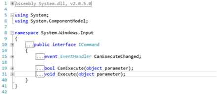
See for more details:
Answer: Data Binding is one of the greatest and most powerful features of XAML (WPF, Silverlight, Windows Phone or Windows 8) compared to other traditional web and Windows app technology in .NET. There was simple data binding for displaying single values, and complex data binding for displaying and formatting a bunch of data. XAML (WPF, Silverlight, Windows Phone or Windows 8 ) however makes it easy to bind nearly any property to any element or object or data source. You take data from some property or object or dependency property and bind it to another dependency property or object or else directly to an element. In a single word you can say in XAML "Data binding is the process of getting information from one object to another and displaying it in one or more elements in the user interface".
How {Binding} works in WPF
The Binding keyword looks as in the following image. Here is the binding of TextBox UI controls with some binding property source object.

Binding to a WPF element from code behind.
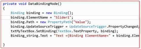
In the above sample a TextBox and slider from code behind using some binding property.
Some Very Useful Properties of the Binding Class
| Property Name | Description |
| Element Name | The name of the element that gets or sets the binding source object when binding to a XAML element. |
| FallbackValue | Set the value to use when the binding does not return values. |
| Converter | Set the converter for the UI element. |
| Mode | Set the Binding diection between the target and source objects. |
| Path | Get or Set the path to the source property of the Binding source. |
| RelativeSource | Gets or Sets the binding source by specifying it's location and relative to the postion of the binding target. |
| Source | Gets or Sets the binding source when not binding to a WPF element. |
| StringFormat | |
| UpdateSourceTrigger | |
| ValidationRules | |
| NotifyOnSourceUpdated | Gets or sets the value determining the direction of the dataflow in the binding. |
| NotifyOnTargetUpdated | Gets or sets a value that indicates whether to raise the source Update event when a value is transferred from the source to the target. |
See for more details:
Answer: A Trigger is typically used in a Style or Control Template. It triggers on properties of whatever is being templated, and sets other properties of the control (or of specific template elements). For example, you would use a Trigger on IsMouseOver to respond to the mouse being over the control, and the setters might update a brush to show a "hot" effect.
Why to use Trigger
Triggers are used in styles to perform actions on a change of any property value or event fires. Triggers create visual effects on controls. By using Triggers we can change the appearance of Framework Elements.
There are five types of triggers supported by WPF; they are:
Example 1: For example, let's say you have a rectangle control. You want to change the background color of that control when the mouse hovers over the rectangle control and revert back when mouse leaves. For this you need to code in the mouse hover event and mouse leave event of the rectangle control in the backend class for changing the color of rectangle as in the following code.
private void Rectangle_MouseMove_1(object sender, MouseEventArgs e)
{
   this.rctback.Fill = Brushes.Red;
}
private void Rectangle_MouseLeave(object sender, MouseEventArgs e)
{
   this.rctback.Fill = Brushes.Green;
}
In the preceding code you have filled the background color of the Rectangle control by writing code in two different events, but a trigger helps to overcome this problem by reducing the code.
See for more details:
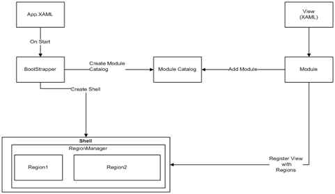
Answer: Prism (Composite Application Guidance for WPF and Silverlight) is designed to build applications in WPF and Silverlight that have a single code base. It helps to develop the client application in a modular fashion so that complexity of a large application can be divided into simpler modules.
In other words “Prism is developed by Microsoft Patterns and Practices and provides guidance designed to help you to more easily design and build rich, flexible and easy-to-maintain Windows Presentation Foundation (WPF) desktop applications.”.
Architecture: The following diagram shows basic architecture:
See for more details:
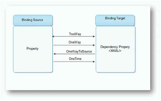
Answer: The DataBinding mode defines the communication direction to the source or the direction of data flow from the source. In XAML (WPF, Silverlight, WP or Win8 App) there are five ways you can bind a data target object to a source.
See for more details:
MVP (Model-View-Presenter)
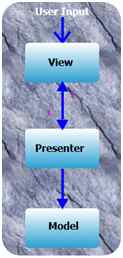
In the MVP pattern the User sends the input to the view, the view forward it to presenter and presenter then modify the view or the model depending on the type of user action. The view and the presenter are tightly coupled through bi-directional relationship. The model does not know about the presenter. The view itself is passive, thats why it's called presenter pattern, since the presenter pushes the data into the view.
MVC (Model-View-Controller)
In this pattern there is only one controller that gets all the inputs directly, it modifies the data in the model depending upon the type of the input. Both the model and the view are created by the controller. The view only knows about the model, but the model does not know about any other objects.
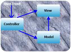
The Model View ViewModel (MVVM) is an architectural pattern used in software engineering that originated from Microsoft which is specialized in the Presentation Model design pattern. It is based on the Model-view-controller pattern (MVC), MVVM is a way of creating client applications that leverages core features of the WPF platform, allows for simple unit testing of application functionality, and helps developers and designers work together with less technical difficulties.
See for more details:
Answer: Templates are an integral part of user interface design in WPF. WPF has the following three types of templates:
Control Template
The ControlTemplate of a control defines the appearance of the control. We can change or define a new look and appearance of a control by simply changing the ControlTemplate of a control. ControlTemplates are even more useful when you write your own controls. Using ControlTemplates, you can build a custom button that has a circular layout and changes its color when you mouse over or press it.
The ControlTemplate element in XAML defines a ControlTemplate at design-time. Templates are usually defined as resources using a FrameworkElement's Resources property. The following code snippet is the syntax for defining a ControlTemplate for a Button element.
<Grid>
   <Grid.Resources>
      <ControlTemplate x:Key="RoundButtonTemplate" />
   </Grid.Resources>
</Grid>
We need to create a circular button where the outer circle of the button is of a different color than the inner circle and when you mouse over and press the button, it changes the background color.
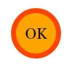
Add a Grid as contents of the ControlTemplate. Add two Ellipse elements within a Grid with different radii and different color fills.
<Grid.Resources>
    <ControlTemplate x:Key="RoundButtonTemplate">
        <Grid>
            <Ellipse Width="100" Height="100" Name="ButtonBorder" Fill="OrangeRed" />
            <Ellipse Width="80" Height="80" Fill="Orange" /> </Grid>
    </ControlTemplate>
</Grid.Resources>
The following code snippet creates a Button element and sets its Template to the ControlTemplate that we created-
<Button Template="{StaticResource RoundButtonTemplate}" >OK</Button>
ItemsPanelTemplate
In the previous example, we saw how a Style element can be used within the resources to group multiple properties of elements and set them using the Style property of elements. However, Style functionality does not end here. Style can be used to group and share not only properties, but also resources and event handlers on any FrameworkElement or FrameworkContentElement.
Styles are resources and used as any other resource and can be applied to the current element, parent element, root element and even on the application level. The scope if styles are similar to any other resources. The resource lookup process first looks up for local styles and if not found, it traverses to the parent element in the logical tree and so on. In the end, the resource lookup process looks for styles in the application and themes.
The Style element in XAML represents a style. The typical definition of the Style element looks as in the following:
<Style>
Setters
</Style>
As you can see from the definition of Style, a Style has one more Setter element. Each Setter consists of a property and a value. The property is the name of the property and the value is the actual value of that property of the element to that the style will be applied to.
Setters Property
The Setters property of Type represents a collection of Setter and EventSetter objects. Listing 4 uses the Setters property and adds a Setter and EventSetter object.
The code snippet in Listing 4 sets the Setters property of a Style by adding a few Setter elements and one EventSetter element using XAML at design-time.
<Grid>
    <Grid.Resources>
        <Style TargetType="{x:Type Button}">
<Setter Property="Width" Value="200"/> <Setter Property="Height" Value="30"/> <Setter Property="Foreground" Value="White"/> <Setter Property="Background" Value="DarkGreen"/> <Setter Property="BorderBrush" Value="Black"/> <EventSetter Event="Click" Handler="Button1_Click"/>
        </Style>
    </Grid.Resources>
    <Button>Click me</Button>
</Grid>
See for more details:
Answer: WPF comes with the following five built-in panels:
The purpose and use of these panels is different. Each panel has a different way to position and reposition child controls placed within that panel. The following articles in this series will summarise these panels and their usages.
Similar to any other WPF control, a Panel control may be represented in two ways. First, at design-time using XAML elements and attributes, and second, at run-time, using a WPF class and its properties.
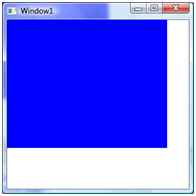
The code snippet in Listing 2 creates a Grid panel at design-time using XAML.
<Window x:Class="CanvasPanelSample.Window1"
   xmlns="https://schemas.microsoft.com/winfx/2006/xaml/presentation"
   xmlns:x="https://schemas.microsoft.com/winfx/2006/xaml"
   Title="Window1" Height="300" Width="300"
   Name="RootWindow">
   <Grid Name="GridPanel" Background="Blue"
      Width="250" Height="200"
      VerticalAlignment="Top"
      HorizontalAlignment="Left"
      FlowDirection="LeftToRight"
   />
</Window>
Listing 2 generates Figure 2.
See for more details:
Answer: Attached properties are basically Dependency Properties that allows the attachment of a value to any random object. Attached Properties (AP) are again a kind of Dependency Property (DP) in XAML. They can be used to receive a notification of a change of themself since they are a type of Dependency Property but one of the differences that these properties have is that they are not defined in the same class they used, unlike DPs.
APs are called “attached” properties because we can attach some behaviour to the control that is originally not expected from that control.
Example
Suppose I have a TextBox control and I want to extend its functionality to accept letters and special symbols but not numeric values.
The AP that I have defined in my class TextBlockExtension.cs is as in the following:
public static bool GetAllowOnlyString(DependencyObject obj)
{
    return (bool) obj.GetValue(AllowOnlyStringProperty);
}
public static void SetAllowOnlyString(DependencyObject obj, bool value)
{
    obj.SetValue(AllowOnlyStringProperty, value);
}
// Using a DependencyProperty as the backing store for AllowOnlyString. This enables animation, styling, binding, etc...
public static readonly DependencyProperty AllowOnlyStringProperty = DependencyProperty.RegisterAttached("AllowOnlyString", typeof (bool), typeof (TextblockExtension), new PropertyMetadata(false, AllowOnlyString));
private static void AllowOnlyString(DependencyObject d, DependencyPropertyChangedEventArgs e)
{
    if (d is TextBox)
    {
        TextBox txtObj = (TextBox) d;
        txtObj.TextChanged += (s, arg) =>
        {
            TextBox txt = s as TextBox;
            if (!Regex.IsMatch(txt.Text, "^[a-zA-Z]*$"))
            {
                txtObj.BorderBrush = Brushes.Red;
                MessageBox.Show("Only letter allowed!");
            }
        };
    }
}
In the code, as we can see, the AP has the default value of False, in other words we need to provide the APs the value true wherever I want this functionality to work for the TextBox.
In my MainWindow.xaml.cs I have defined my TextBox as in the following:
<TextBox Width="200" Height="50" local:TextblockExtension.AllowOnlyString="True"></TextBox>
See for more details:
Answer: Windows Presentation Foundation (WPF) resources provide a simple way to reuse commonly defined objects and values. Resources in WPF allow you to set the properties of multiple controls at a time. For example, you can set the background property on several elements in a WPF application using a single resource.
The best way of defining the resources is on a Window or Page element level. Any resource that you define for an element also applies to their child elements of that element.
If you define a resource for the grid element, then the resource applies only to the child elements of the grid element.
Syntax for resources in WPF is as follows:
<elementName propertyName="{markupExtension keyName}">
<!-Content -->
</elementName>
There are two types of resource, namely,
Static Resource
We should use the StaticResource markup extension to define the resource as a static resource. The value of StaticResource is determined at the time of loading.
<Grid.Resources>
   <SolidColorBrush x:Key="lblbgcolor" Color="Blue"/>
</Grid.Resources>
<Label Name="lbl" Margin="71,44,77,0" Background="{StaticResourcelblbgcolor}" Height="49" />
Dynamic Resource
Dynamic Resource we use in a situation where we want to change the value of property at run time.
<Window.Resources>
   <SolidColorBrush x:Key="brush" Color="Red" />
</Window.Resources>
<Button x:Name="btn" Content="Click Me" Click="Button_Click" Background="{DynamicResource brush}" Height="100" Width="100" />
Open Code behind and add the following code snippet:
private void Button_Click(object sender, RoutedEventArgs e)
{
   this.btn.SetResourceReference(BackgroundProperty, "brush");
}
See for more details:
Answer
The most basic difference is that StaticResource evaluates the resource one time only, but DynamicResource evaluates it every time the resource is required. And due to this reason, DyanamicResource is heavy on the system but it makes pages or windows load faster.
Static Resources
A Static Resource will be resolved and assigned to the property during the loading of the XAML that occurs before the application is actually run. It will only be assigned once and any changes to the resource dictionary is ignored.
Static resource references work best for the following circumstances:
Dynamic Resources
A Dynamic Resource assigns an Expression object to the property during loading but does not actually lookup the resource until runtime when the Expression object is asked for the value. This defers looking up the resource until it is needed at runtime.
Dynamic resources work best for the following circumstances:
Example
<Window.Resources>
    <SolidColorBrush x:Key="brush" Color="Green" />
    <Style TargetType="Border" x:Key="PageBackground">
<Setter Property="Background" Value="Gold"/>
    </Style>
</Window.Resources>
<Grid>
    <Border Style="{DynamicResource PageBackground}">
        <Button x:Name="btn" Content="Rajkumar Test" Click="Button_Click" Background="{DynamicResource brush}" Height="30" Margin="53,130,85,130" /> </Border>
</Grid>
You can apply on code behind like the following,
private void Button_Click(object sender, RoutedEventArgs e)
{
   this.btn.SetResourceReference(BackgroundProperty, "brush");
}
See for more details:
Answer: WPF has provided some extended services to the CLR property that we can collectively call Dependency Properties. A Dependency Property is a property whose value depends on the external sources, such as animation, data binding, styles, or visual tree inheritance. Not only this, but a Dependency Property also has the builtin feature of providing notification when the property has changed, data binding and styling.
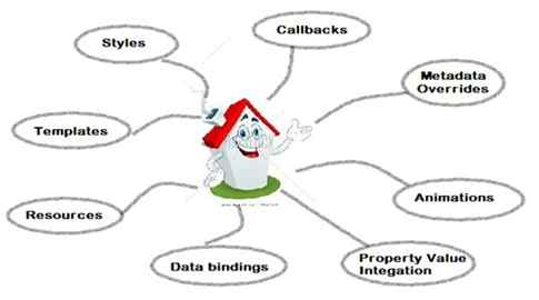
Advantages of a Dependency Property:
Code
public class CarDependencyProperty: DependencyObject
{
    //Register Dependency Property
    public static readonly DependencyProperty CarDependency = DependencyProperty.Register("MyProperty", typeof (string), typeof (DependencyPropertySample));
    public string MyCar
    {
        get
        {
            return (string) GetValue(CarDependency);
        }
        set
        {
            SetValue(CarDependency, value);
        }
    }
}
public partial class CarDependencyPropertyDemo: Window
{
    public CarDependencyPropertyDemo()
    {
        InitializeComponent();
    }
    private void MyButton_Click(object sender, RoutedEventArgs e)
    {
        CarDependency dpSample = TryFindResource("CarDependency ") as CarDependency;
        MessageBox.Show(dpSample.MyCar);
    }
}
See for more details:
Answer: Attached Properties (AP) can be used to receive a notification of a change of themself since they are a type of Dependency Property but one of the differences that these properties have is that they are not defined in the same class they used, unlike DPs. One of the misconceptions that a WPF developer usually has is that these properties can only be defined in the parent control the control in which we want to use them.
AP can be defined in one of the following three contexts:
Example
public static bool GetAllowOnlyString(DependencyObject obj)
{
    return (bool) obj.GetValue(AllowOnlyStringProperty);
}
public static void SetAllowOnlyString(DependencyObject obj, bool value)
{
    obj.SetValue(AllowOnlyStringProperty, value);
}
// Using a DependencyProperty as the backing store for AllowOnlyString. This enables animation, styling, binding, etc...
public static readonly DependencyProperty AllowOnlyStringProperty = DependencyProperty.RegisterAttached("AllowOnlyString", typeof (bool), typeof (TextblockExtension), new PropertyMetadata(false, AllowOnlyString));
private static void AllowOnlyString(DependencyObject d, DependencyPropertyChangedEventArgs e)
{
    if (d is TextBox)
    {
        TextBox txtObj = (TextBox) d;
        txtObj.TextChanged += (s, arg) =>
        {
            TextBox txt = s as TextBox;
            if (!Regex.IsMatch(txt.Text, "^[a-zA-Z]*$"))
            {
                txtObj.BorderBrush = Brushes.Red;
                MessageBox.Show("Only letter allowed!");
            }
        };
    }
}
In the code, as we can see, the AP has the default value of False, in other words we need to provide the APs the value true wherever I want this functionality to work for the TextBox.
In my MainWindow.xaml.cs I have defined my TextBox as in the following:
<TextBox Width="200" Height="50" local:TextblockExtension.AllowOnlyString="True"></TextBox>
See for more details:
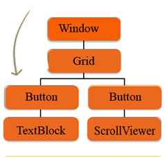
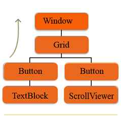
Answer: Routed Events is about the Hierarchy of the controls you are using in the Events. Routed Events are a new Infrastructure given by WPF that permit events to tunnel down the tree to the target elements or Bubble up to the Root element. Routed Events are just like normal events.
Types of Routed Events
Routed Events are of three types, which are as follows:
Tunneling Events: Tunneling events are the reverse of the Bubbling events. Tunneling Events raised first in the controls hierarchy. These events are raised by the Root elements. This allows events to tunnel down the tree.
Bubbling Events: Bubbling Events are those Events which are first raised by the control than raised by the other controls in the control hierarchy. It allows Bubble up to the tree till the Root Element. First Tunneling events are raised then bubbling events raised.
Direct Event: Direct Event is generally raised by the control itself. The behavior of this event is same as the .NET general event.
See for more details:
Answer: RotateTransform rotates an element clockwise by a specified angle about the point. The RotateTransform object in WPF represents RotateTransform. The Angle property represents the angle in degrees to rotate clockwise. The CenterX and CenterY properties represent the X and Y coordinates of the center point. By default, a ScaleTransform is centered at the point (0,0), which corresponds to the upper-left corner of the rectangle.
Creates two rectangles with same position and sizes accept the second rectangle is rotated at 45 degrees.
<Grid>
    <!-- Original Rectangle -->
    <Rectangle Width="200" Height="50" Fill="Yellow" />
    <!-- Rectangle with 45 degrees rotation -->
    <Rectangle Width="200" Height="50" Fill="Blue" Opacity="0.5">
        <Rectangle.RenderTransform>
            <RotateTransform CenterX="0" CenterY="0" Angle="45" /> </Rectangle.RenderTransform>
    </Rectangle>
</Grid>
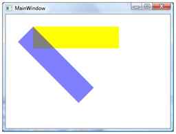
The following code snippet changes the values of CenterX and CenterY.
<Rectangle Width="200" Height="50" Fill="Blue" Opacity="0.5" Margin="61,27,117,184">
   <Rectangle.RenderTransform>
      <RotateTransform CenterX="-50" CenterY="50" Angle="45" />
   </Rectangle.RenderTransform>
</Rectangle>
See for more details:
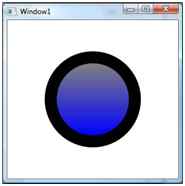
Answer: The ControlTemplate contains the tree of elements that define the desired look. After you define a ControlTemplate you can attach it to any Control or Page by setting it's TemplateProperty.
<Grid>
    <Grid.Resources>
        <ControlTemplate x:Key="buttonTemplate">
            <Grid>
                <Ellipse Width="160" Height="160" x:Name="outerCircle">
                    <Ellipse.Fill>
                        <LinearGradientBrush StartPoint="0,0" EndPoint="0,1">
                            <GradientStop Offset="0" Color="Green"></GradientStop>
                            <GradientStop Offset="1" Color="Purple"></GradientStop>
                        </LinearGradientBrush>
                    </Ellipse.Fill>
                </Ellipse>
                <Ellipse Width="120" Height="120">
                    <Ellipse.Fill>
                        <LinearGradientBrush StartPoint="0,0" EndPoint="0,1">
                            <GradientStop Offset="0" Color="Gray"> </GradientStop>
                            <GradientStop Offset="1" Color="Blue"> </GradientStop>
                        </LinearGradientBrush>
                    </Ellipse.Fill>
                </Ellipse>
            </Grid>
            <ControlTemplate.Triggers>
                <Trigger Property="Button.IsMouseOver" Value="True">
                    <Setter TargetName="outerCircle" Property="Fill" Value="Black"> </Setter>
                </Trigger>
                <Trigger Property="Button.IsPressed" Value="True">
                    <Setter Property="RenderTransform">
                        <Setter.Value>
                            <ScaleTransform ScaleX=".8" ScaleY=".8"> </ScaleTransform>
                        </Setter.Value>
                    </Setter>
                    <Setter Property="RenderTransformOrigin" Value=".6,.6"> </Setter>
                </Trigger>
            </ControlTemplate.Triggers>
        </ControlTemplate>
    </Grid.Resources>
    <Button Template="{StaticResource buttonTemplate}">Click Me</Button>
</Grid>
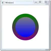
After MouseOver:
See for more details:
Answer: We can create a borderless window in two ways.
Firstly, by writing a WindowStyle property = None, SingleBorderWindow, ThreeDBorderWindow or ToolWindow in the <Window> element.
<Window x:Class="WpfApp1.MainWindow" xmlns="https://schemas.microsoft.com/winfx/2006/xaml/presentation" xmlns:x="https://schemas.microsoft.com/winfx/2006/xaml" Title="MainWindow" Height="350" Width="525" WindowStyle="None">
    <Grid> </Grid>
</Window>
The second way is to open the Property Window, select the window style property to either None, SingleBorderWindow, ThreeDBorderWindow or ToolWindow.
See for more details:
Answer: Extensible Application Markup Language and pronounced "zammel" is a markup language used to instantiate .NET objects. Although XAML is a technology that can be applied to many different problem domains, its primary role in life is to construct WPF user interfaces.
Important task XAML performs as as follows,
Type of XAML
See for more details:
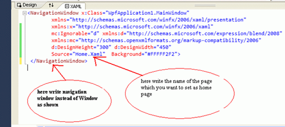
Answer:The Navigation Window class is derived from the Window class, so it inherits all the properties of Windows such as methods, properties and events. The navigation window provides backward and forward buttons for navigating to pages that we have visited before or have yet to visit.
Creating Navigation Paged Application: To create Navigation Window based applications, use a Navigation Window container instead of a Window container as shown in the following picture and the source is the property of the Navigation window and write the name of the page that you want to set as the home page as shown in the following picture:
See for more details:
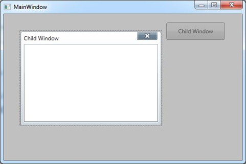
Answer: A ChildWindow control is a light weight window that can be used as a child window or a popup control. The parent window is automatically disabled when a child window is active and modal. You can think of a ChildWindow as a custom modal or modeless dialog where you can place any child controls you want. However, the ChildWindow has several common Window properties.
Creating a ChildWindow:
The ChildWindow element represents a WPF ChildWindow control in XAML. The ChildWindow control is defined in the System.Windows.Controls namespace.
creates a simple ChildWindow control with its Width, Height, Name, IsModal and Caption property.
<wpfx:ChildWindow Name="PopupChildWindow" Caption="Child Window" Width="300" Height="200"IsModal="True" />
We need to call the Show() method to make a Child Window visible.
See for more details:
Answer:Content Controls are mainly parent containers to hold the content. It displays information to the user to be viewed but that generally won't be modified.
With content controls, the following aspects:
Code Snippet
<Button Name="btnAdd" Content="Add" Click="btnAdd_Click" />
See for more details:
Answer: The Tab control is a common UI element that has been around for some time. It makes a convenient way to organize your window when there is more than could realistically fit and still be comprehensible. Tab Control is easier in Windows Presentation Foundation.
Two elements play main roles in building a tab control:
TabControl is the container of one or more TabItem elements like as follows.
<TabControl>
   <TabItem Header="Tab 1">xyz</TabItem>
   <TabItem Header="Tab 2">abc</TabItem>
</TabControl>
In WPF, Tabs are very easy to implement. Create a new WPF Window, remove the default Grid tags, and add the following XAML:
<TabControl>
   <TabItem Header="Tab 1">xyz</TabItem>
   <TabItem Header="Tab 2">abc</TabItem>
</TabControl>
See for more details:
Answer: Clipping a region is a process of displaying partial area of a region by setting the outline of a region. In WPF, the clipping has been extended to all elements that are inherited from UIElement that includes controls, images, panels, Windows, and Pages.
<Window.Clip>
   <EllipseGeometry Center="150,160" RadiusX="120" RadiusY="120" />
</Window.Clip>
The following code snippet clips or crops an image to an ellipse.
<Image Source="Garden.jpg">
    <Image.Clip>
        <EllipseGeometry Center="150,160" RadiusX="120" RadiusY="120" />
    </Image.Clip>
</Image>
private void ClipImage()
{
    // Create a BitmapImage
    BitmapImage bmpImage = new BitmapImage();
    bmpImage.BeginInit();
    bmpImage.UriSource = new Uri(@ "C:\Images\Garden.jpg", UriKind.RelativeOrAbsolute);
    bmpImage.EndInit();
    // Clipped Image
    Image clippedImage = new Image();
    clippedImage.Source = bmpImage;
    EllipseGeometry clipGeometry = new EllipseGeometry(new Point(150, 160), 120, 120);
    clippedImage.Clip = clipGeometry;
    LayoutRoot.Children.Add(clippedImage);
}
See for more details:
Answer: Converters provide substantial supremacy since they allow insertion of an object between a source and a target object. At a high level, converters are a chunk of custom code hooked up using the binding and the data will flow via that converter. So, whenever data is flown from a source to a target, one can change the value or can change the type of object that needs to be set on the target property.
So, whenever data travels from source to target, it can be transformed in two ways:
Defining a converter
Defining any converter requires implementation of an IValueConverter interface in a class. This interface has the following two methods:
How to use
Once your class is part of a ResourceDictionary, you can point to the instance of the converter using the Converter property of Binding, along with a StaticResource markup extension.
Where to place converters
To implement an IValueConverter one must create a class and then put the instance of that class in a ResourceDictionary within your UI.
See for more details:
Answer: This is a property on a binding that controls the data flow from a target to a source and used for two-way data binding. The default mode is when the focus changes but there are many other options available.
Properties available with UpdateSourceTrigger
Default vs LostFocus
Default and LostFocus means the same thing for most of the controls with the exception of DataGrid. For DataGrid:
Code
<grid>
    <Grid.ColumnDefinitions>
        <ColumnDefinition Width="50*" />
        <ColumnDefinition Width="50*" />
     </Grid.ColumnDefinitions>
    <TextBlock Text="Source:" Width="auto" />
    <TextBox Name="SourceText" Width="160" Height="30" Margin="48,0,44,82" />
    <TextBlock Text="Target:" Grid.Column="1" Width="auto" />
    <TextBox Name="TargetText" Width="160" Height="30" Text="{Binding ElementName=SourceText, Path=Text,UpdateSourceTrigger=Default}" Grid.Column="1" Margin="44,0,47,82" />
</grid>
Output
When the user types into the source TextBox:

See for more details:
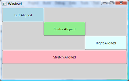
Answer:The FrameworkElement has two alignment properties: HorizontalAlignment and Vertical Alignment. The Horizontal Alignment property is a type of HorizontalAlignment enumeration and represents how a child element is positioned within a parent element horizontally.
The HorizontalAlignment enumeration has the four properties Left, Center, Right and Stretch. The Left, Center and Right properties sets a child element to left, center and right of the parent element. The Stretch property stretches a child element to fill the parent element's allocated layout space.
Example
<StackPanel Background="LightGray">
    <Button Name="Rect1" Background="LightBlue" Width="150" Height="50" HorizontalAlignment="Left" Content="Left Aligned" />
    <Button Name="Rect2" Background="LightGreen" Width="150" Height="50" HorizontalAlignment="Center" Content="Center Aligned" />
    <Button Name="Rect3" Background="LightCyan" Width="150" Height="50" HorizontalAlignment="Right" Content="Right Aligned" />
    <Button Name="Rect4" Background="LightPink" Height="50" HorizontalAlignment="Stretch" Content="Stretch Aligned" />
</StackPanel>
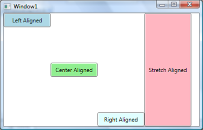
The VerticalAlignment property is a type of HorizontalAlignment enumeration and represents how a child element is positioned within a parent element vertically.
The VerticalAlignment enumeration has the four properties Top, Center, Bottom and Stretch. The Top, Center and Bottom properties set a child element to top, center or bottom of the parent element. The Stretch property stretches a child element to fill the parent element's allocated layout space vertically.
Example
<Grid>
    <Grid.ColumnDefinitions>
        <ColumnDefinition Width="100" />
        <ColumnDefinition Width="100" />
        <ColumnDefinition Width="100" />
        <ColumnDefinition Width="100" />
     </Grid.ColumnDefinitions>
    <Button Name="Button1" Background="LightBlue" Height="30" Width="100" VerticalAlignment="Top" Content="Left Aligned" />
    <Button Name="Button2" Background="LightGreen" Height="30" Width="100" Grid.Column="1" VerticalAlignment="Center" Content="Center Aligned" />
    <Button Name="Button3" Background="LightCyan" VerticalAlignment="Bottom" Height="30" Width="100" Grid.Column="2" HorizontalAlignment="Left" Content="Right Aligned" />
    <Button Name="Button4" Background="LightPink" Content="Stretch ligned" Width="100" Grid.Column="3" HorizontalAlignment="Stretch" />
</Grid>
See for more details:
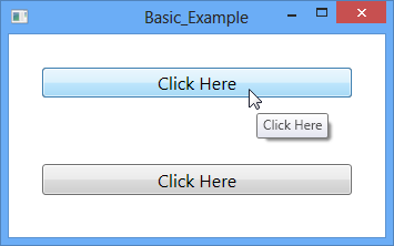
Answer: A ToolTip control shows some information or a hint about a control in a floating box when the mouse hovers over that control and it disappears when the mouse is moved away from that control.
Tool tips are used to help the users to learn the purpose of Controls in many Windows-based programs. Tooltips are nothing but small rectangles that appear when the user hovers the mouse pointer over the Control. The rectangle contains a short piece of text describing the control. Once displayed, the tips disappear when the user moves the mouse pointer away from the linked control or clicks a mouse button, or after a short delay.
ToolTip Example: Drag a Button control from the toolbox and drop it. Add a ToolTip property to the button with a message you want to show on mouse hover of the button. We can add a ToolTip in two ways. First the button shows the simplest way to display a ToolTip. The second method is preferred for creating a customized ToolTip.
<Button Content="Click Here" Margin="30" FontSize="16" ToolTip="Click Here"></Button>
<Button Content="Click Here" Margin="30" FontSize="16">
    <Button.ToolTip>
        <ToolTip> Click Here </ToolTip>
    </Button.ToolTip>
</Button>
See for more details:
Answer: A ListBox control is an items control that works as a ListBox control but only one item from the collection is visible at a time and clicking on the ListBox makes the collection visible and allows users to pick an item from the collection. Unlike a ListBox control, a ListBox does not have multiple item selection.
The ListBox element represents a ListBox control in XAML.
<ListBox></ListBox>
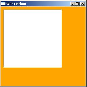
The Width and Height properties represent the width and the height of a ListBox. The x:Name property represents the name of the control, which is a unique identifier of a control. The Margin property sets the location of a ListBox on the parent control. The HorizontalAlignment and VerticalAlignment properties are used to set horizontal and vertical alignments.
The code sets the vertical and horizontal alignment of the ListBox and sets the margin.
<ListBox x:Name="ListBox1" Width="200" Height="200"
   VerticalAlignment="Top" HorizontalAlignment="Left"
   Margin="10,10,0,0">
</ListBox>
See for more details:
Answer: A popup window is a window that floats over a page or window providing functionality for some quick action. For example, a login control on a page or window or an animated popup tip of a control.
The Popup element of XAML represents a WPF Popup control.
<Popup></Popup>
The Width and the Height properties represent the width and the height of a Popup. The Name property represents the name of the control that is a unique identifier of a control. The Margin property is used to set the location of a Popup on the parent control. The HorizontalAlignment and VerticalAlignment properties are used to set horizontal and vertical alignments.
The following code snippet sets the name, height, and width of a Popup control. The code also sets horizontal alignment to left and vertical alignment to top.
<Popup Margin="10,10,0,13" Name="Popup1" HorizontalAlignment="Left"
VerticalAlignment="Top" Width="194" Height="200" />
Open a Popup: The Popup Control displays its contents when IsOpen set true.
private void Popup_Ok_Click(object sender, RoutedEventArgs e)
{
   Popup1.IsOpen = true;
}
Where popup1 is the name of the popup control.
Closing a Popup: The Popup Control displays its contents when IsOpen is set to false.
private void Popup_Ok_Click(object sender, RoutedEventArgs e)
{
   Popup1.IsOpen = false;
}
See for more details:
Answer: Decorator class that is a simple base class of WPF layout controls. Decorators have a single child control to which they apply a single child control.
Add a click event to the button. Replace the Button's XAML with the following:
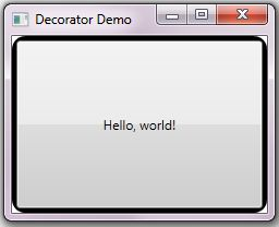
<Border Name="MyBorder" BorderBrush="Black" BorderThickness="4" CornerRadius="10">
   <Button Click="Button_Click">Hello, world!</Button>
</Border>
When the program is executed the window that appears similar to the image below:
See for more details:
Advantages
Disadvantages
See for more details:
|
WPF Assembly |
Meaning in Life |
| WindowsBase.dll | Defines the base infrastructure of WPF, including dependency properties support. While this assembly contains types used within the WPF framework, the majority of these types can be used within other .NET applications. |
| PresentationCore.dll | This assembly defines numerous types that constitute the foundation of the WPF GUI layer. |
| PresentationFoundation.dll | This assembly—the ‘meatiest’ of the three—defines the WPF controls types, animation and multimedia support, data binding support, and other WPF services. For all practical purposes, this is the assembly you will spend most of your time working with directly. |
Although these assemblies provide hundreds of types within numerous namespaces, consider this partial list of WPF namespaces:
| WPF Namespace | Meaning in Life |
| System.Windows | Here you will find core types such as Application and Window that are required by any WPF desktop project. |
| System.Windows.Controls | Here you will find all of the expected WPF widgets, including types to build menu systems, tool tips, and numerous layout managers. |
| System.Windows.Markup | This namespace defines a number of types that allow XAML markup and the equivalent binary format, BAML, to be parsed. |
| System.Windows.Media | Within these namespaces you will find types to work with animations, 3D rendering, text rendering, and other multimedia primitives. |
| System.Windows.Navigation | This namespace provides types to account for the navigation logic employed by XAML browser applications / desktop navigation apps. |
| System.Windows.Shapes | This namespace defines basic geometric shapes (Rectangle, Polygon, etc.) used by various aspects of the WPF framework. |
See for more details:
Answer:Silverlight and Windows Presentation Foundation (WPF) are 2 different products from Microsoft, but have lot of overlap. Silverlight is a subset of WPF in terms of features and functionality. Silverlight was of course known as WPF/E where E means everywhere. Both use XAML, a form of XML to define controls but WPF is purely for windows while Silverlight runs in the browser on Windows and Macs. So, here are the differences between WPF and Silverlight:
See for more details:
Answer: The AccessText control in WPF converts a character preceded by an underscore to an Access Key. The Access Key is registered and therefore raises an event when pressed.
Creating an AccessText
The AccessText element represents an AccessText control in XAML.
<AccessText>_Click Me</AccessText>
The following code snippet adds an AccessText to a Button control. The button control click event will be raised when you select the ALT+C keys on the keyboard.
<Button Name="Button1" Width="120" Height="50" Margin="33,70,59,124" FontSize="16" Click="Button1_Click">
    <AccessText>_Click Me</AccessText>
</Button>
If there are multiple underscore characters, only the first one is converted into an AccessKey; the other underscores appear as normal text. If the underscore that you want converted to the access key is not the first underscore, use two consecutive underscores for any underscores that precede the one that you want to convert.
See for more details:
Answer: Brushes and pens are objects used to draw and fill graphics objects. WPF and XAML work together and there is an WPF class corresponding to each XAML control. For example, <SolidColorBrush> tag in XAML and SolidColorBrush class in WPF, both represent the solid color brush. You can create and use brushes in both ways seperately or mix them.
In XAML and WPF model provides the following brush objects:
See for more details:
Answer: Bitmap effects are simple pixel processing operations. A bitmap effect takes a BitmapSource as an input and produces a new BitmapSource after applying the effect.
Bitmap effects enable designers and developers to apply visual effects to rendered Microsoft Windows Presentation Foundation (WPF) content. For example, bitmap effects allow you to easily apply a DropShadowBitmapEffect effect or a blur effect to an image or a button. The unmanaged APIs provide an extensible framework for independent hardware vendors (IHVs) to develop custom effects to use in WPF applications.
The following are the available Bitmap Effects in WPF:
Each bitmap effect has properties that can control the filtering properties, such as Radius of BlurBitmapEffect.
See for more details:
Answer: A TreeView represents data in a hierarchical view in a parent child relationship where a parent node can be expanded or collapse. The left side bar of Windows Explorer is an example of a TreeView.
The TreeView tag represents a WPF TreeView control in XAML.
<TreeView></TreeView>
Adding TreeView Items
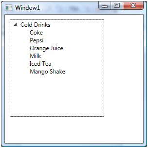
A TreeView control hosts a collection of TreeViewItem. The Header property is the text of the item that is displayed on the view. The following code snippet adds a parent item and six child items to a TreeView control.
<TreeView Margin="10,10,0,13" Name="TreeView1" HorizontalAlignment="Left" VerticalAlignment="Top" Width="194" Height="200">
    <TreeViewItem Header="Cold Drinks">
        <TreeViewItem Header="Coke"></TreeViewItem>
        <TreeViewItem Header="Pepsi"></TreeViewItem>
        <TreeViewItem Header="Orange Juice"></TreeViewItem>
        <TreeViewItem Header="Milk"></TreeViewItem>
        <TreeViewItem Header="Iced Tea"></TreeViewItem>
        <TreeViewItem Header="Mango Shake"></TreeViewItem>
    </TreeViewItem>
</TreeView>
Deleting TreeView Items
We can use TreeView.Items.Remove or TreeView.Items.RemoveAt method to delete an item from the collection of items in the TreeView. The RemoveAt method takes the index of the item in the collection.
<Button Height="23" Margin="226,14,124,0" Name="DeleteButton"
VerticalAlignment="Top" Click="DeleteButton_Click">
Delete Item</Button>
private void DeleteButton_Click(object sender, RoutedEventArgs e)
{
   TreeView1.Items.RemoveAt
   (TreeView1.Items.IndexOf(TreeView1.SelectedItem));
}
The above code removes root items from the TreeView, not the subitems. To remove sub items, first we need to find the selected item and then we need to call TreeViewItem.Items.RemoveAt method.
See for more details:
Answer:Commands have several purposes. The first purpose is to separate the semantics and the object that invokes a command from the logic that executes the command. This allows for multiple and disparate sources to invoke the same command logic, and it allows the command logic to be customized for different targets. For example, the editing operations Copy, Cut, and Paste, which are found in many applications, can be invoked by using different user actions if they are implemented by using commands. An application might allow a user to cut selected objects or text by either clicking a button, choosing an item in a menu, or using a key combination, such as CTRL+X. By using commands, you can bind each type of user action to the same logic.
Commands are used to share grouped actions within an application in different ways. Sometimes we need to perform the same activity, WPF provides us a feature called Command to make our work easier and faster.
There are basically four type of Commands:
XAML
<StackPanel>
    <Menu>
        <MenuItem Command="ApplicationCommands.Paste" /> </Menu>
    <TextBox />
</StackPanel>
C#
// Creating the UI objects
StackPanel mainStackPanel = new StackPanel();
TextBox pasteTextBox = new TextBox();
Menu stackPanelMenu = new Menu();
MenuItem pasteMenuItem = new MenuItem();

// Adding objects to the panel and the menu
stackPanelMenu.Items.Add(pasteMenuItem);
mainStackPanel.Children.Add(stackPanelMenu);
mainStackPanel.Children.Add(pasteTextBox);

// Setting the command to the Paste command
pasteMenuItem.Command = ApplicationCommands.Paste;

// Setting the command target to the TextBox
pasteMenuItem.CommandTarget = pasteTextBox;
See for more details:
Answer: The Canvas is the most basic layout panel in WPF. It's child elements are positioned by explicit coordinates. The coordinates can be specified relative to any side of the panel usind the Canvas.Left, Canvas.Top, Canvas.Bottom andCanvas.Right attached properties.
The panel is typically used to group 2D graphic elements together and not to layout user interface elements. This is important because specifing absolute coordinates brings you in trouble when you begin to resize, scale or localize your application. People coming from WinForms are familiar with this kind of layout - but it's not a good practice in WPF.
In WPF, a Canvas Panel has a very simple layout. We can position any object using its two properties:
Note: A Canvas panel does not resize automatically when our normal application resizes in the browser.
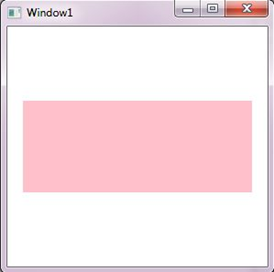
Here is an example of a Canvas panel:
<Canvas Background="Pink" Width="250" Height="100">
</Canvas>
See for more details:
Answer: The TextBlock control is one of the most fundamental controls in WPF, yet it's very useful. It allows you to put text on the screen, much like a Label control does, but in a simpler and less resource demanding way. A common understanding is that a Label is for short, one-line texts (but may include e.g. an image), while the TextBlock works very well for multiline strings as well, but can only contain text (strings). Both the Label and the TextBlock offers their own unique advantages, so what you should use very much depends on the situation.
Creating a TextBlock
The TextBlock element represents a WPF TextBlock control in XAML.
<TextBlock/>
The Width and Height attributes of the TextBlock element represent the width and the height of a TextBlock. The Text property of the TextBlock element represents the content of a TextBlock. The Name attribute represents the name of the control, which is a unique identifier of a control. The Foreground property sets the foreground color of contents. This control does not have a Background property.
<TextBlock Name="TextBlock1" Height="30" Width="200"
   Text="Hello! I am a TextBlock." Foreground="Red">
</TextBlock>
The output looks like the following,

See for more details:
Answer: A Tab Control has tab items and each tab item represents a container that is used to host other controls.
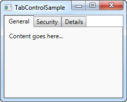
The WPF TabControl allows you to split your interface up into different areas, each accessible by clicking on the tab header, usually positioned at the top of the control. Tab controls are commonly used in Windows applications and even within Windows' own interfaces, like the properties dialog for files/folders etc.
Just like with most other WPF controls, the TabControl is very easy to get started with. Here's a very basic example:
<Window x:Class="WpfTutorialSamples.Misc_controls.TabControlSample" <Window x:Class="WpfTutorialSamples.Misc_controls.TabControlSample" xmlns="https://schemas.microsoft.com/winfx/2006/xaml/presentation" xmlns:x="https://schemas.microsoft.com/winfx/2006/xaml" Title="TabControlSample" Height="200" Width="250">
    <Grid>
        <TabControl>
            <TabItem Header="General">
                <Label Content="Content goes here..." /> </TabItem>
            <TabItem Header="Security" />
            <TabItem Header="Details" /> </TabControl>
    </Grid>
</Window>
See for more details:
Answer: Virtualization technique in WPF improves the rendering performance of UI elements. By applying virtualization, the layout system ensures that only the visible items of a container are rendered on the screen. For example, a list control may have thousands of items but virtualization will reduce the rendering to the visible items only.
VirtualizingStackPanel: The VirtualizingStackPanel control in WPF is used to implement virtualization.The IsVirtualizing property of the VirtualizingStackPanel activates the virtualization. By default, the IsVirtualizing property is set to true. When IsVirtualizing is set to false, a VirtualizingStackPanel behaves the same as an ordinary StackPanel.
<VirtualizingStackPanel Width="300" Height="200" />
The VirtualizingStackPanel.VirtualizationMode property has two values, Standard and Recycling. The default value of VirtualizationMode is Standard and means that the VirtualizingStackPanel creates an item container for each visible item and discards it when it is no longer needed (such as when the item is scrolled out of view). When an ItemsControl contains many items, the process of creating and discarding item containers can degrade performance. In that case, using the Recycling reuses item containers instead of creating a new one each time.
See for more details:
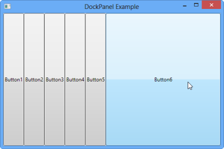
Answer: A DockPanel is a panel where each child element docks to one of the four edges. DockPanel enables docking of child elements to an entire side of the panel streching it to fill the entire height or width.
The DockPanel makes it easy to dock content in all four directions (top, bottom, left and right). This makes it a great choice in many situations, where you want to divide the window into specific areas, especially because by default, the last element inside the DockPanel, unless this feature is specifically disabled, will automatically fill the rest of the space (center).
<Window x:Class="DockPanelExample1.MainWindow" xmlns="https://schemas.microsoft.com/winfx/2006/xaml/presentation" xmlns:x="https://schemas.microsoft.com/winfx/2006/xaml" Title="DockPanel Example" Height="350" Width="525">
    <DockPanel>
        <Button Content="Button1"></Button>
        <Button Content="Button2"></Button>
        <Button Content="Button3"></Button>
        <Button Content="Button4"></Button>
        <Button Content="Button5"></Button>
        <Button Content="Button6"></Button>
    </DockPanel>
</Window>
Preview
See for more details:
Answer: XAML StatusBar represents a status bar. A StatusBar is a horizontal window that usually sits at the bottom of a window to display various kinds of status information of an application.
The StatusBar element in XAML represents a WPF StatusBar control.
<StatusBar></StatusBar>
The Width and Height properties represent the width and the height of a StatusBar. The Name property represents the name of the control that is a unique identifier of a control.
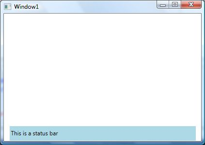
The following code snippet creates a StatusBar control and set its content to some text.
<StatusBar Name="McSBar" Height="30" VerticalAlignment="Bottom"
   Background="LightBlue" >
   This is a status bar
</StatusBar>
The output looks as in the following figure:
See for more details:
Answer: A polyline is an object in AutoCAD that consists of one or more line (or arc) segments. A rectangle is an example of a polyline that you are already familiar with. As you've seen, it is one object that can be modified and worked with easier than four separate lines.
In other words, A polyline is a collection of connected straight lines. The Polyline object represents a polyline shape and draws a polyline with the given points. The Points property represents the points in a polyline. The Stroke property sets the color and StrokeThickness represents the width of the line of a polyline.
Creating a Polyline: The Polyline element in XAML creates a polyline shape. The following code snippet creates a polyline by setting its Points property. The code also sets the black stroke of width 4.
<Polyline
   Points="10,100 100,200 200,30 250,200 200,150"
   Stroke="Black"
StrokeThickness="4" />
The Polyline element in XAML creates a polyline shape. The following code snippet creates a polyline by setting its Points property. The code also sets the black stroke of width 4.
<Polyline
   Points="10,100 100,200 200,30 250,200 200,150"
   Stroke="Black"
StrokeThickness="4" />